Veena Bijo

Walgreens Kiosk Experience

Walgreens Kiosk Experience

2024-25
Clients /
Personal/Conceptual
Even when shopping in-store, consumers rely on mobile devices. In 2024, a survey revealed that nearly eight-in-10 (77%) consumers search for items on their mobile devices while in a store.
2024-25
Clients /
Personal/Conceptual
Even when shopping in-store, consumers rely on mobile devices. In 2024, a survey revealed that nearly eight-in-10 (77%) consumers search for items on their mobile devices while in a store.

Walgreens Card Finder:
A Kiosk Experience

2024-25
Clients /
Personal/Conceptual
I stood in the greeting card aisle for 20 minutes and left empty handed. In this case study, I redesigned the greeting card experience at Walgreens to make heartfelt connections easier to find.

Team

My roles

Tools

Veena Bijo

UI/UX Designer
UX Researcher

Figma
Adobe Creative Suite

BACKGROUND AND PROBLEM

Greeting Cards: Heartfelt Messages Lost in Bad UX

What should’ve been a quick card run turned into a full-blown scavenger hunt in the Walgreens greeting card aisle. With too many options, confusing categories, and zero help, I was left wondering if I should just text "Happy Birthday" instead.

However, as a designer, this inspired me to look for solutions. The Walgreens Card Finder reimagines the card-shopping experience to make finding the perfect message as easy (and fun) as giving it.

THE MISSION

What Do I Wish to Accomplish?

Using a human-centered design approach, this project explores how to make the card-shopping experience more intuitive and emotionally satisfying. The goal is to improve wayfinding, simplify decision-making, and bring more joy to a small but meaningful moment.

Through research, user insights, and thoughtful interface design, the solution aims to ease frustration, support emotional connection, and turn a cluttered retail experience into one that feels clear, personal, and purposeful.

TARGET AUDIENCE

What Does the Customer Base Look Like?

Women (primarily)
Millennials
Generation X
Gen Z
Businesses
Party-goers
Loved ones

RESEARCH

Site Visits: Competitor Analysis

Uncovering Relationships: 2X2 Matrices

Collecting Data: Task Analysis

To gather insights into real customer experiences with purchasing cards, I performed task analyses with three individuals from diverse backgrounds and with varying goals. Each participant was carefully selected to represent different age groups, genders, life stages, and professions.

Discovering Insights: Journey Mapping

The analysis started from entice and enter to exit and extend. I developed journey maps for each persona to identify actions, thoughts, experience/emotions, pain points, and solutions.

Journey Map 1

PAIN POINTS:

• Too many of the same product identification displays for the same types of cards
• Under represented
• No employee assistance
• No outlet for customer feedback
• Loss of time

SOLUTIONS:

• Color coding card sections
• Keeping all niche cards in one section and have brands behind wayfinding panels
• Employee training on card finding assistance
• Provide QR code for quick customer survey on card displays or receipts
• Kiosks for digital look ups

FOCUS AREAS

The Digital Age Calls For a Digital Solution

Even when shopping in-store, consumers rely on mobile devices. In 2024, a survey revealed that nearly eight-in-10 (77%) consumers search for items on their mobile devices while in a store.

Through market research, I discovered that some retailers offer digital tools—such as mobile apps or in-store kiosks—to help customers locate products more easily. In an age where technology is central to everyday life, shoppers should be able to enjoy a seamless, stress-free experience. This insight inspired the direction of my project: designing the user interface for an in-store kiosk at Walgreens.

Filtering Out the Clutter

Much like using library computers to locate a book or Target’s kiosks to find product locations, customers value quick and convenient tools for finding items in-store.

By adding a feature that filters out unrelated results, the experience becomes more efficient—reducing clutter, minimizing frustration, and ultimately improving overall user satisfaction.

An Outlet for Customer Feedback

To encourage ongoing customer feedback, I decided to include a QR code on all screens. This allows users to quickly share their experience using their mobile device at any time of the process. Making feedback easily accessible not only helps identify areas for improvement but also shows customers that their opinions are valued.

OUTCOMES AND RESULTS

Goals Achieved

Through a user-centered UI/UX process that included interviews, task analysis, market research, journey mapping, wireframing, and interactive prototyping in Figma, this project successfully redesigned the card-finding experience at Walgreens. The solution focused on removing friction from the customer journey, enhancing digital integration, and aligning with Walgreens’ values and market trends.

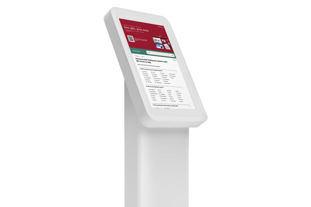
1. Streamlined Card Discovery: Developed an intuitive filter system that simplifies the card selection process, reducing decision fatigue, making in-store navigation more efficient, and providing users an enjoyable experience finding cards.

2. Customer Feedback Valued: Implemented a QR code feature to collect real-time customer feedback, promoting transparency and reinforcing Walgreens’ values of honesty, trust, and continuous improvement.

3. Enhanced Digital Touchpoint: Created a kiosk interface that reflects modern UI patterns and user expectations—bringing a digital-first mindset into the physical store experience.

4. Customer-Centric Design: Prioritized accessibility and ease of use through clear visual hierarchy, guided interactions, and thoughtful user flow—rooted in insights from journey mapping and task analysis.

5. Alignment with Walgreens' Brand Values: The final design supports Walgreens’ long-standing principles of quality service, community engagement, and compassionate care, while staying relevant in today’s retail landscape.

Lessons Learned:

As a designer for this project, the following are lessons I learned:

1. Balancing Independence with Collaboration: Working as the sole designer on the Card Finder project taught me how to manage multiple responsibilities and make confident design decisions independently. However, I also learned the value of regularly seeking feedback from peers to challenge my assumptions and strengthen the overall design.

2. Design is Iterative, Not Linear: Throughout the process, I was reminded that great design doesn’t happen in a straight line. Each round of testing, feedback, and refinement revealed new insights that improved the experience, reinforcing the importance of staying flexible and open to change. A kiosk design was not the initial solution I had in mind; it was through extensive research and considering several factors that led to final outcome.

3. Business and Brand Alignment Matters: I learned how important it is to align design solutions not just with user needs but also with the brand’s mission and business goals. Incorporating Walgreens’ core values into the final design helped ensure the solution felt authentic and on-brand.

As a researcher for this project, the following are lessons I learned:

1. Effective Research Starts with Clear Goals: Conducting task analysis and market research taught me the importance of setting clear research objectives from the start. Having focused goals helped me stay organized, ask the right questions, and extract insights that directly informed design decisions.

2. Talking to Experts Adds Valuable Perspective: Interviewing a lead designer at Hallmark reinforced how valuable expert insights can be, especially when designing for niche or emotionally-driven experiences like greeting cards. Their input provided real-world context that couldn’t be captured through desk research alone.

3. Insights Are Only as Good as Their Application: One of the biggest lessons was realizing that research isn’t valuable unless it's directly tied back to the design. Synthesizing data into actionable insights, and ensuring they’re carried through the design process, was key to creating a meaningful user experience.

The Walgreens Card Finder was a project that I started because of a difficult experience I had finding the right greeting card while in a rush at Walgreens. This inspired me to look for solutions.

I visited supermarket chains that sold greeting cards and noted their pain points and advantages.

In doing so, I studied how companies use wayfinding to help guide customers to their desired cards. I conducted task analysis by asking participants to find three types of greeting cards, providing me with real user feedback.

Also, I had the honor of interviewing a former lead graphic designer at Hallmark to gather details on the design process of greeting card wayfinding and trends.

Even when shopping in-store, consumers rely on mobile devices. Based on these findings, I designed the UI for a kiosk application, a prototype developed in Figma for in-store use.